请注意,本文编写于 568 天前,最后修改于 476 天前,其中某些信息可能已经过时。
目录
本篇文章将使用对比的手法讲解Less和Scss的语法,让你快速上手Less和Scss
预处理器介绍
前端最常用的预处理器 有 scss和 less两种。
less特点
- 官网
- less 用node写的,可在浏览器中引入less.js不需要预编译
- 优势 编译快
- 缺点: 复杂特性书写比较繁琐, 功能不如scss强大
scss特点
- 官网
- 用ruby写的,编译慢,所以有了移植版本, node-sass
- scss安装比较恶心,项目中经常遇到环境问题,因为它与node版本有依赖关系
- 不过现在又除了一个工具叫dart-scss没这个问题了
- dart-sass性能好 (node-sass实时编译,dart-sass 保存时编译)
- 目前最新版
dart-sass已经更名为sass
补充sass 与scss可以理解为一个东西,唯一的区别是sass使用锁进表示层级关系,scss使用花括号{} 表示层级关系
命令行使用
- less
lessc 2-variable.less > 2-variable.css - scss
node-sass --output-style expanded 2-variable.scss > 2-variable-scss.css
预处理器的作用
- 可读性强 嵌套语法:反映层级关系和约束
- 逻辑复用
- Extend和Mixin代码片段
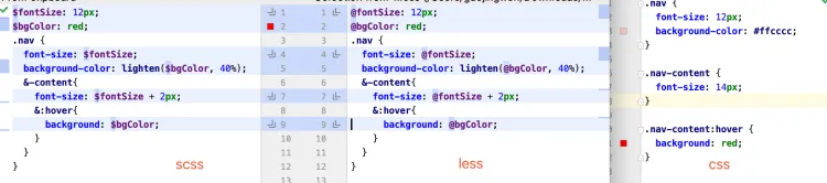
- 变量和计算: 减少重复代码
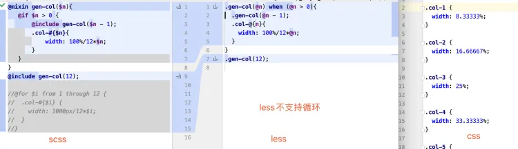
- 循环 用于负复杂有规律的样式
- 模块化
import导入
语法
变量、嵌套、内置函数
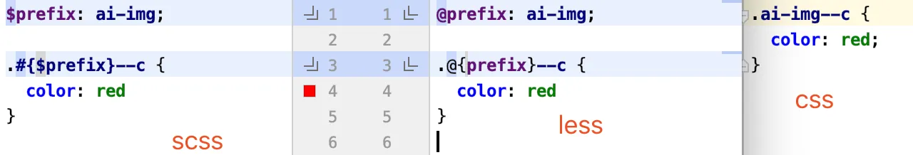
命名空间
mixin
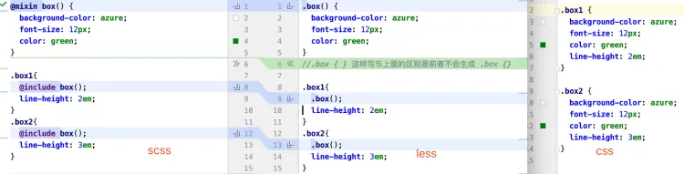
extend

循环
import 两者一样
@import "./6-import-variable";
案例 0.5px边框
css.box {
  height: 200px;
  width: 200px;
  background: linear-gradient(180deg, #ebecf1, #ebecf1 50%, transparent 50%) top left no-repeat,
              linear-gradient(360deg, #ebecf1, #ebecf1 50%, transparent 50%) bottom left no-repeat;
  background-size: 100% 1px, 100% 1px;
  background-color: #ffffff;
}
scss写法
scss/**
  0.5px 精美边框 函数
  $directions 是一个数组 (T, B, R, L)
  T代表top, B代表bottom, R代表right, L代表left 循序无关
  $borderColor 颜色值
  例子: @include myBorders((T, B));
 */
$color-gray-border: #ebecf1;
$color-white: #ffffff;

@mixin myBorders($directions, $borderColor: $color-gray-border, $bg-color: $color-white) {
  $directionsMap: (
          L: linear-gradient(90deg, $borderColor, $borderColor 50%, transparent 50%) bottom left no-repeat,
          R: linear-gradient(270deg, $borderColor, $borderColor 50%, transparent 50%) bottom right no-repeat,
          T: linear-gradient(180deg, $borderColor, $borderColor 50%, transparent 50%) top left no-repeat,
          B: linear-gradient(360deg, $borderColor, $borderColor 50%, transparent 50%) bottom left no-repeat
  );
  $sizesMap: (
          L: 1px 100%,
          R: 1px 100%,
          T: 100% 1px,
          B: 100% 1px
  );
  $dirResult: ();
  $sizResult: ();
  @each $direction in $directions {
    $dirResult: append($dirResult, map_get($directionsMap, $direction), comma);
    $sizResult: append($sizResult, map_get($sizesMap, $direction), comma);
  }
  background: $dirResult;
  background-size: $sizResult;
  background-color: $bg-color;
}

.box {
  height: 200px;
  width: 200px;
 @include myBorders((T, B));
}
less就没有那么灵活了
less/* 0.5px 精美边框 函数
    T代表top, B代表bottom, R代表right, L代表left
    borders-h 水平(上下)边框
    borders-v 垂直(左右)边框
    borders-h-v 上下左右边框
  例:
    .borders1 {
      .borders-h()
    }
*/
.borders-h(@borderColor: @color-line-gray, @bg-color: @color-main-white) {
  background: linear-gradient(180deg, @borderColor, @borderColor 50%, transparent 50%) top left no-repeat, linear-gradient(360deg, @borderColor, @borderColor 50%, transparent 50%) bottom left no-repeat;
  background-size: 100% 1px, 100% 1px;
  background-color: @bg-color;
}
.borders-v(@borderColor: @color-line-gray, @bg-color: @color-main-white) {
  background: linear-gradient(90deg, @borderColor, @borderColor 50%, transparent 50%) bottom left no-repeat, linear-gradient(270deg, @borderColor, @borderColor 50%, transparent 50%) bottom right no-repeat;
  background-size: 1px 100%, 1px 100%;
  background-color: @bg-color;
}
.borders-h-v(@borderColor: @color-line-gray, @bg-color: @color-main-white) {
  background: linear-gradient(180deg, @borderColor, @borderColor 50%, transparent 50%) top left no-repeat, linear-gradient(360deg, @borderColor, @borderColor 50%, transparent 50%) bottom left no-repeat, linear-gradient(90deg, @borderColor, @borderColor 50%, transparent 50%) bottom left no-repeat, linear-gradient(270deg, @borderColor, @borderColor 50%, transparent 50%) bottom right no-repeat;
  background-size: 100% 1px, 100% 1px, 1px 100%, 1px 100%;
  background-color: @bg-color;
}
/* 0.5px边框 单条边框的情况
    例:
    .border-top {
      .border(T) // T,B,L,R分别代表top,bottom,left,right
    }
*/
.border-direction(@d, @borderColor) when (@d=B) {
  background-size: 100% 1px;
  background-position: bottom left;
  background-image: linear-gradient(360deg, @borderColor, @borderColor 50%, transparent 50%);
}
.border-direction(@d, @borderColor) when (@d=T) {
  background-size: 100% 1px;
  background-position: top left;
  background-image: linear-gradient(180deg, @borderColor, @borderColor 50%, transparent 50%);
}
.border-direction(@d, @borderColor) when (@d=L) {
  background-size: 1px 100%;
  background-position: bottom left;
  background-image: linear-gradient(90deg, @borderColor, @borderColor 50%, transparent 50%);
}
.border-direction(@d, @borderColor) when (@d=R) {
  background-size: 1px 100%;
  background-position: top right;
  background-image: linear-gradient(270deg, @borderColor, @borderColor 50%, transparent 50%);
}
.border(@d:B, @borderColor: @color-line-gray) {
  background-repeat: no-repeat;
  .border-direction(@d, @borderColor);
}
css预处理器框架
(别人封装好的工具库给你用)
- SASS - Compass http://compass-style.org/
- Less - Lesshat/EST http://ecomfe.github.io/est/
- 提供现成的mixin
- 类似JS类库 封装常用功能
PreCSS Stylus https://stylus.bootcss.com/
本文作者:郭敬文
本文链接:
版权声明:本博客所有文章除特别声明外,均采用 BY-NC-SA 许可协议。转载请注明出处!
目录