目录
本文系统梳理CSS盒模型及盒模型布局。详细讲解内容盒模型与边框盒模型异同,系统讲解BFC创建条件及应用,系统讲解Flex布局新老版本,详解flex属性值,简单总结grid布局及案例,另外通过案例快速了解掌握table布局。
面试题
- 什么是盒模型?有哪些盒模型?
li与li之间为什么有空白?如何解决- 有遇到过
margin不生效的问题吗?如何解决? - 多行文本溢出省略号如何实现?
flex属性有哪些快捷值,分别是什么含义?flex画骰子- 你了解
grid吗说说它与flex的异同 - 为什么不建议使用
table布局
带着问题从文中找答案吧
盒模型
什么是盒模型?
- 在页面中,每个元素被表示为一个矩形的方框,这就是盒子。
- 元素在页面中会生成盒子,一张页面是由一个或多个盒子组成的, 这就是盒模型
盒子从内到外由内容(Content)、内边距(Padding)、边框(Border)和外边距(Margin)组成,如下图:
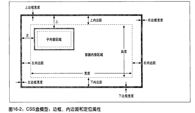
marginborderpading是盒模型的一部分
内容盒模型
- 盒子实际内容(
content)的width/height=我们设置的width/height; - 盒子总宽度/高度=
width/height+padding+border+margin
边框盒模型
box-sizing: border-box(起源IE的bug 怪异模式)- 盒子的(content)宽度+内边距
padding+边框border宽度=我们设置的width(height也是如此) - 盒子总宽度/高度=
width/height+margin= 内容区宽度/高度 +padding+border+margin
盒主要包括了块盒、行内盒、匿名盒(没有名字不能被选择器选中的盒)以及一些实验性的盒(未来可能添加到规范中)。盒的类型由display属性决定。
块级盒子(block box)
display的值为block、table或者list-item的元素是块级元素(block level element),它们会生成块级盒子(block level box)并且参加块级格式化上下文(Block Formatting Context,BFC)。
块级盒行为如下:
- 盒子会在内联的方向上扩展并占据父容器在该方向上的所有可用空间,在绝大数情况下意味着盒子会和父容器一样宽,每个盒子都会换行
width和height属性可以发挥作用- 内边距(padding), 外边距(margin) 和 边框(border) 会将其他元素从当前盒子周围“推开”
内联盒子(inline box)
display的值为inline
内联盒子行为如下
- 盒子不会产生换行。
width和height属性将不起作用。- 垂直方向的内边距、外边距以及边框会被应用但是不会把其他处于 inline 状态的盒子推开。
- 水平方向的内边距、外边距以及边框会被应用且会把其他处于 inline 状态的盒子推开。
行内块盒子
display有一个特殊的值inline-block,它在内联和块之间提供了一个中间状态。(对外inline特性对内block特性)
这对于以下情况非常有用: 您不希望一个项切换到新行,但希望它可以设定宽度和高度,并避免上面看到的重叠。
它的行为如下:
- 设置
width和height属性会生效。 padding,margin, 以及border会推开其他元素。
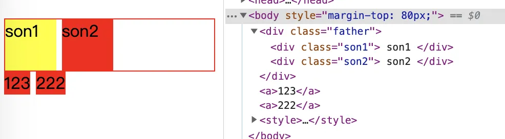
行内元素或行内块元素之间的空白问题
浏览器会把inline内联元素之间的空白字符(空格、换行、Tab)等渲染成一个空格。为了美观通常换成一行,会占用一个字符的宽度
解决办法:
- 设置
float:left- 不足:有些容器是不能设置浮动,如左右切换的焦点图等。
- 将所有写在同一行。
- 不足:代码不美观。
- 将内的字符尺寸直接设为0,即
font-size:0。- 不足:中的其他字符尺寸也被设为0,需要额外重新设定其他字符尺寸,且在Safari浏览器依然会出现空白间隔。
- 消除的字符间隔
letter-spacing:-8px,- 不足:这也设置了内的字符间隔,因此需要将内的字符间隔设为默认
letter-spacing:normal。
- 不足:这也设置了内的字符间隔,因此需要将内的字符间隔设为默认
外边距折叠(margin塌陷)问题
定义: 在CSS中,两个或多个毗邻的普通流中的盒子(父子关系、祖先关系、兄弟元素)在垂直方向上的外边距会发生叠加,这种形成的外边距称之为外边距叠加
- 毗邻
- 毗邻说明了他们的位置关系,没有被
padding、border、clear和line-box分隔开。
- 毗邻说明了他们的位置关系,没有被
- 两个或多个
- 两个或多个盒子是指元素之间的相互影响,单个元素不会存在外边距叠加的情况。
- 垂直方向
- 只有垂直方向的外边距会发生外边距叠加。水平方向的外边距不存在叠加的情况。
- 父子or祖先关系的 上外边距或下外边距
- 兄弟元素的 下边距和上边距
- 普通流
- 只要不是
float、absolutely positioned和root element时就是in flow root-element即display: flow-root
- 只要不是
参考资料:
BFC
What?
BFC(Block Formatting Context)块级格式化上下文,是Web页面中盒模型布局的CSS渲染模式,指一个独立的渲染区域或者说是一个隔离的独立容器。
首先说一下盒模型与BFC之间的关系
- 每个块级盒都会参与
BFC的创建 - 每个块级元素都会至少生成一个块级盒,称为主块级盒;一些元素可能会生成额外的块级盒,比如
<li>,用来存放项目符号
BFC的创建条件
- 根元素(
<html>) - 浮动元素(元素的
float不是none) - 绝对定位元素(元素的
position为absolute||fixed) - 行内块元素(元素的
display为inline-block) - 表格单元格(元素的
display为table-cell,HTML表格单元格默认为该值)- 表格标题(元素的
display为table-caption,HTML表格标题默认为该值) - 匿名表格单元格元素(元素的
display为table、table-row、table-row-group、table-header-group、table-footer-group(分别是HTML标签table、row、tbody、thead、tfoot的默认属性)或inline-table)
- 表格标题(元素的
overflow计算值(Computed)不为visible的块元素display值为flow-root的元素contain值为layout、content或paint的元素- 弹性元素(
display为flex或inline-flex元素的直接子元素) - 网格元素(
display为grid或inline-grid元素的直接子元素) - 多列容器(元素的
column-count或column-width(en-US) 不为auto,包括column-count为1)column-span为all的元素始终会创建一个新的BFC,即使该元素没有包裹在一个多列容器中(标准变更,Chrome bug)。
应用场景(解决的问题)
- 不存在外边距折叠
- 清除浮动不被浮动元素覆盖
- 自适应两栏布局
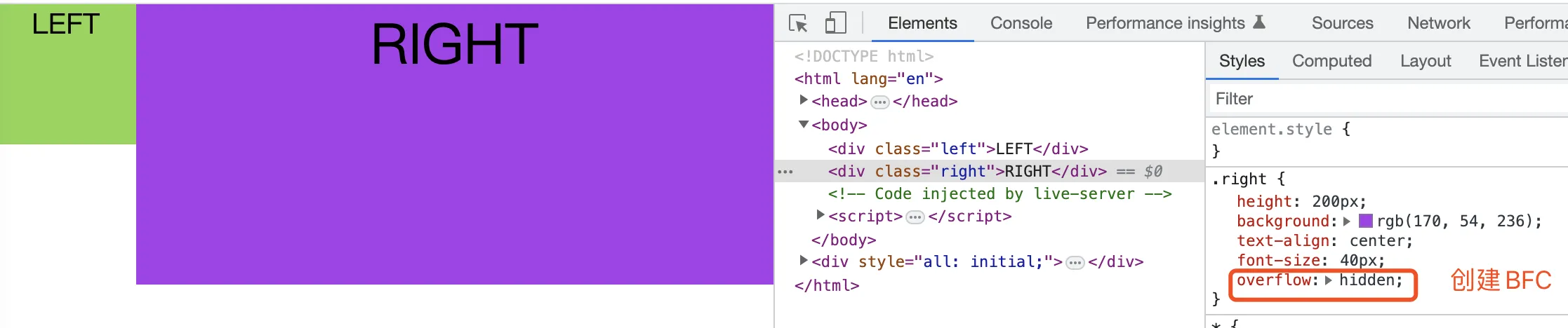
案例:自适应两栏布局
html<!DOCTYPE html>
<html lang="en">
  <head>
    <meta charset="UTF-8">
    <meta name="viewport" content="width=device-width, initial-scale=1.0">
    <meta http-equiv="X-UA-Compatible" content="ie=edge">
    <title>Document</title>
  </head>
  <style>
    *{
      margin: 0;
      padding: 0;
    }
    body {
      width: 100%;
    }
    /* 自适应两栏布局 */
    .left {
      width: 100px;
      height: 100px;
      float: left;
      background: rgb(139, 214, 78);
      text-align: center;
      font-size: 20px;
    }
    .right {
      height: 200px;
      background: rgb(170, 54, 236);
      text-align: center;
      font-size: 40px;
      /* width: 100% */ /* 不要设置宽度,块级元素会宽度自适应 */
      overflow: hidden; /* 添加此行代码 */
    }
  </style>
  <body>
    <div class="left">LEFT</div>
    <div class="right">RIGHT</div>
  </body>
</html>
IFC
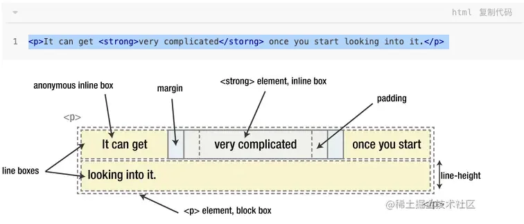
Inline Formatting Contexts,也就是“内联格式化上下文”。
渲染规则
- 各行内框(inline boxes)一个接一个地排列,其排列顺序根据书写模式(writing-mode)的设置来决定
- 这些盒子垂直方向的起点从包含块盒子的顶部开始
- 水平方向上的 padding、border、margin 会把其他内联盒推开而垂直方向不会
- 行框(线盒): 能把在一行上的框都完全包含进去的一个矩形区域。行框的宽度是由包含块和存在的浮动来决定。
- 行框内的行内框如果在行内方向上排不下是会创建新行,一个行内框可能被被分割到多行中时,该行内框的 margins, borders, 以及 padding 的设定均不会在断裂处生效。
- 行内框可使用vertical-align属性在块的方向上对齐
- text-align可用于将各行内框在行框内对齐。
- 内联盒的高度由line-height决定
- 浮动元素会使行内框变窄。
值得注意的是display: inline-block,以单个封闭块来参与外部的 IFC,而内部则生成了一个 BFC
参考资料:
用途
- 上下间距不生效可以使用IFC
- 多个元素水平居中
- float元素优先排列,挤占其他行内盒空间
- 解决元素垂直居中、多个文本元素行高不一致排列混乱。
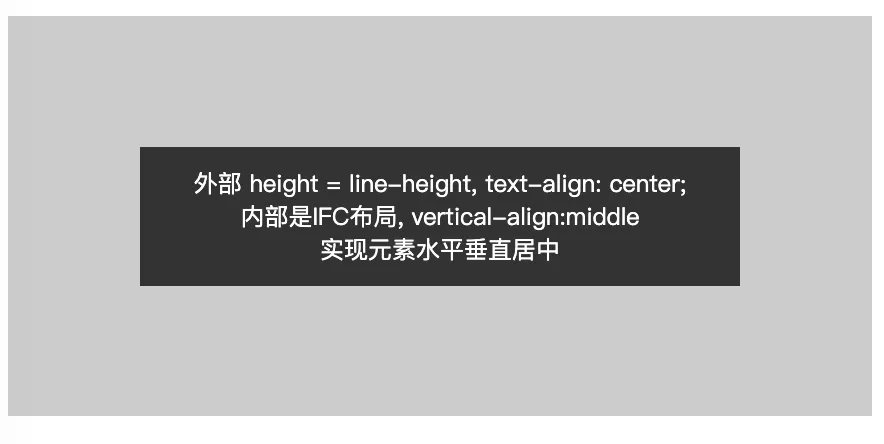
案例:IFC实现元素水平垂直居中
代码如下:
html<!doctype html>
<html lang="zh">
<head>
	<meta charset="UTF-8">
	<style>
		.wrap {
			line-height: 300px;
			width: 100%;
			height: 300px;
			background-color: #ccc;
			font-size: 0;
		}
		p {
			line-height: normal;
			display: inline-block;
			vertical-align: middle;
			background-color: #333;
			font-size: 18px;
			padding: 10px;
			width: 360px;
			color: #fff;
		}
	</style>
</head>
<body>
<div class="wrap">
	<p>
		外部 height = line-height <br>
		内部是IFC布局,使用vertical-align:middle方法来实现文本垂直居中
	</p>
</div>
</body>
</html>
运行效果
FFC (Flex布局)
语法
关于flex语法,建议先看阮一峰老师的《flex语法篇》 , 接着再看他的《Flex布局教程:实例篇》,最后在看我这里的总结。 由于阮老师文章比较早,部分flex相关属性的值不全,以下内容既是我的总结,也有我对flex布局知识的补充和完善。
flex记忆 心法口诀
- 四个概念: 容器(父元素)、 项目(子元素)、 主轴、交叉轴
- 设置了
flex后 项目的floatvertical-alignclear属性会失效。 - 容器有以下6个属性 (以下属性值列举的第一个值均为默认值)
flex-direction决定主轴的方向row|row-reverse|column|column-reverse
flex-wrap是否允许换行nowrap|wrap|wrap-reverse
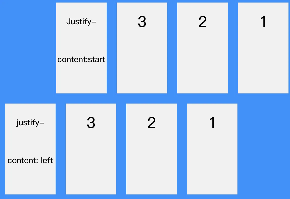
flex-flowflex-direction和flex-wrap的简写justify-content定义项目在主轴的对齐方式(默认横轴为主轴,随flex-direction改变)flex-start|flex-end|center|start|end|stretch|space-between|space-around|space-evenly|left|right|normal
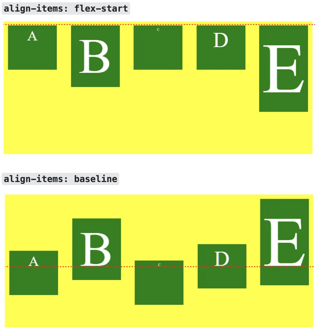
align-items定义项目在交叉轴的对齐方式stretch|flex-start|flex-end|center|start|end|normal|baseline|self-start|self-end
align-content定义了多根轴线的对齐方式,如果只有一根则不起作用stretch|flex-start|flex-end|center|start|end|space-between|space-around|space-evenly|normal|baseline
- 项目有以下6个属性
order定义项目的排列 数值越小排列越靠前,默认值为0flex-grow定义项目的放大比例 默认0,即如果存在剩余空间也不放大flex-shrik定义项目的缩小比例 默认1, 0表示不缩小flex-basis在分配多余空间之前,项目占据的主轴空间,默认值为auto,即项目分身大小- 值:
auto|content|fit-content|max-content|min-content
- 值:
flex以上三个属性的简写,默认值0 1 auto, 建议优先使用这个值- 有两个快捷值
auto1 1 auto|none0 0 auto
- 有两个快捷值
align-self允许单个项目与其他项目有不一样的对齐方式, 可覆盖align-items属性,默认值autoauto|flex-start|flex-end|start|end|center|stretch|baseline|self-start|self-end
关于flex属性值更多细节
align-items属性值baseline与flex-start的区别
justify-content属性值 flex-start 与start的区别
参考资料 这里
- 一种说法是: W3C 一直在开发 盒模型对齐,start一组通用的对齐属性的值之一,用于多个盒子模型,包括 flex、grid、table 和 block。
- 另外下面还一种说法是 在 flex-direction为 *-reverse时有差异
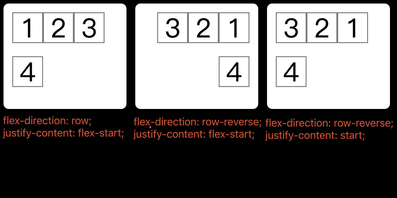
这个效果翻译成文字: 如果您希望项目与 flex-direction 定义的 end 对齐,请使用 flex-end。要将其与对齐容器的末端对齐,请使用 end
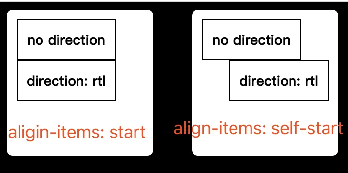
align-items属性的值self-start 与 start的区别
self-start会受到到 direction属性的影响
justify-content属性的值 start与left的区别
start会受到 direction属性的影响,如下图 direction: rtl;
justify-content: normal是啥意思
参考资料:https://stackoverflow.com/questions/57720598/what-is-the-default-value-of-justify-content
大概意思是:
- 因为 justify-content 是在两个不同的规范中定义的,先有Flex布局,后来W3C想定义一个通用的盒模型对齐方案
- 在 flex和grid中 normal 的行为类似stretch
justify-content属性值 safe center与 unsafe center的区别
- 设置溢出对齐方式,默认是unsafe, 如果项目溢出会出现前面的几个项目看不到或只能看到部分内容
- safe则不会上上述问题,目前仅在Firefox有效果
justify-contentjustify-itemsjustify-selfalign-contentalign-itemsalign-self都有该属性值
应用
- 一般面试中问flex大都会问到画骰子
- 再者会问flex实现圣杯布局和双飞翼布局
- 其它还有:网格布局、输入框布局、悬挂式布局、固定的低栏、流式布局
- - TODO 悬挂LINK
老版本Flex
老实说个人一直不愿意学老版flex, 觉得它是被淘汰的东西,但是有个东西,多行文本溢出省略号只能又该来实现,另外它也可以实现一些布局(如水平垂直居中),所以它并没有被淘汰,还是要去了解它。
多行文本溢出
css.muti-lines {
  display: -webkit-box;
  overflow: hidden;
  word-break: break-all;
  text-overflow: ellipsis;
  -webkit-box-orient: vertical;
  -webkit-line-clamp: 2;
}
版本更迭
flexbox布局的语法规范经过几年发生了很大的变化。从2007年07月,flex第一版本的工作草案发布,到2012年09月,flex最新版本成为候选推荐。flex主要经历了三个版本
- 旧版本
display:box | inline-box; - 混合版本
display:flexbox | inline-flexbox;- 该版本只有IE10支持,且需要添加前缀-ms-(IE即将推出历史舞台,不用学这个了)

- 新版本
display: flex | inline-flex- 该版本兼容
IE11+、firefox、safari、chrome、opera及移动端,但移动端ios7.1-8.4需要添加前缀-webkit-
- 该版本兼容
综上现在还要需学一下 display: box即可,可能是因为display:box是草案,没有最终成为标准, 所以需要加浏览器前缀display: -webkit-box
-webkit-box语法
容器属性
box-orient确定容器内项目的排列方向 有一点点像flex-directionhorizontal|vertical|inline-axis|block-axis
box-direction确定项目的排列顺序 有一点点像flex-directionnormal|reverse
box-align项目在交叉轴上的对齐方式 类似align-itemsstart|end|center|baseline|stretch
box-pack项目在主轴上的对齐方式 类似justify-contentbox-lines容器内的项目是否换行 不生效single|multiple
项目属性
box-flex项目的分配权重 类似flex属性box-ordinal-group项目的排列优先级 类似order属性
案例水平垂直居中
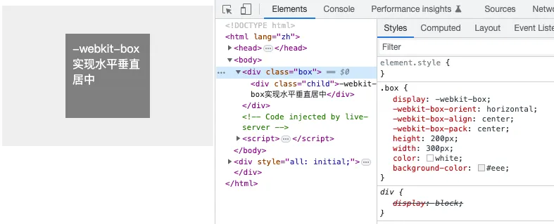
html<!doctype html>
<html lang="zh">
  <head>
    <meta charset="UTF-8">
    <style>
      .box {
        display: -webkit-box;
        -webkit-box-orient: horizontal;
        -webkit-box-align: center;
        -webkit-box-pack: center;
        height: 200px;
        width: 300px;
        color: white;
        background-color: #eee;
      }
     .child {
        height: 100px;
        width: 100px;
        background-color: gray;
				padding: 10px;
      }
    </style>
  </head>
  <body>
    <div class="box">
      <div class="child">-webkit-box实现水平垂直居中</div>
    </div>
  </body>
</html>
Grid(GFC)网格布局
Grid布局与Flex具有一定的相似性,都可以指定容器内部多个项目的位置。但是他们也有重大区别。
- Flex布局是轴线布局,只能指定“项目”针对轴线的位置,可以看作是一维布局;
- Grid布局则是将容器划分成“行”和“列”,产生单元格,然后指定“项目所在的单元格”,可以看作是二维布局。
Grid布局远比Flex强大。
Grid布局入门推荐先看阮老师的《CSS Grid 网格布局教程》,以下内容是个人总结。
Grid布局核心概述
- 与flex一样有容器、项目、主轴、交叉轴四个概念,此外grid还有行、列、单元格、网格线的概念。
- 也分容器属性和项目属性两块内容
- 项目中的
float、display:inline-block、display:table-ceil、vertical-align和column-*等设置都将失效
容器属性
grid-template-columns、grid-template-rows属性划分行和列,定义每一个列的列宽和每一行的行高repeat()简化重复的值 如repeat(3, 33.33%)、repeat(2, 10px 20px 8px)auto-fill有的单元格大小是固定的但容器的大小不是固定的,希望每一行(列)尽可能容纳更多的单元格fr为了方便表示比例关系minmax()产生一个长度范围,表示长度就在这个范围内 如minmax(100px, 1fr) 表示不小于100px 不大于1frauto该行或列的长度自适应- 网格线的名称 每一个指定的网格线,方便后续引用 如
grid-template-rows: [c1] 100px [c2] 100px [c3]- 网格线只为为了后续引用是设置单元格使用,并非真实存在,所以你用它实现border效果
grid-row-gapgrid-column-gap设置行与行列与列的间隔- 推荐使用
row-gapcolumn-gap - 可以定义单个网格线的样式吗? 不能,因为网格线是虚拟存在的
- 网格线的命名是配合容器的
grid-template-areas属性及项目的grid-columngrid-rowgrid-area使用
- 推荐使用
grid-template-areas网格布局允许指定区域,一个区域有一个或多个单元格组成,该属性用于定义区域。grid-template-areas: 'a b' 'c d';grid-template-areas: 'header header header' 'sidebar main main' 'footer footer footer';grid-template-areas: 'a.' '. .';某些区域不需要利用则用.表示
grid-auto-flow指定项目的排列方式,row先行后列colmn先列后行row|column|row dense|column dense
justify-items、align-items、place-itemsalign-items设置单元格内容的垂直对齐方式 属性值同Flex布局的align-itemsjustify-items设置单元格水平对齐位置 属性值同 Flex的justity-items此外还有三个值leftrightlegacyplace-items<justify-items> <align-items>
justify-contentalign-contentplace-content- 定义整个内容区域在容器中的水平or垂直对齐方式
place-content属性值同Flex布局的justify-contentalign-content
grid-auto-columns、grid-auto-rows- 定义网格多余的列宽和行高
grid-template是grid-template-columnsgrid-template-rowsgrid-template-areas的合并简写方式grid是grid-template-rows、grid-template-columns、grid-template-areas、grid-auto-rows、grid-auto-columns、grid-auto-flow的合并简写形式
项目属性
grid-column-start、grid-column-end、grid-row-start、grid-row-end、grid-columngrid-row- 通过指定项目的网格线可以调整项目在容器中的位置
- 这四个属性如果产生了重叠,则使用z-index属性指定项目中的层叠位置
- span关键字表示跨越
grid-column是grid-column-start和grid-column-end的简写grid-row是grid-row-start和grid-row-end的简写
grid-area<row-start>/<column-start>/<row-end>/<column-end>justify-self、align-self、place-items- 属性值同
justify-itemsalign-itemsplace-items一一对应
- 属性值同
小试牛刀
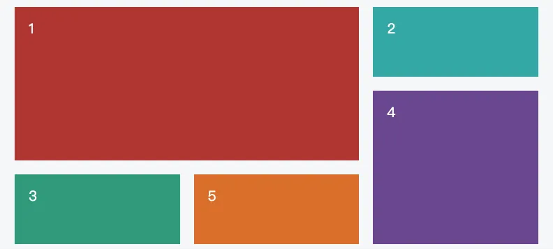
html<!doctype html>
<html lang="zh">
<head>
	<meta charset="UTF-8">
	<title>Document</title>
	<style>
		.p {
			height: 150px;
			width: 300px;
			background-color: #888888;
			display: grid;
			grid-template-columns: repeat(3, 80px);
			grid-template-rows: repeat(3, 32px);
      /* grid-template-areas 也是一种方式*/
			place-content: space-around space-evenly;
		}
		.item {
			background-color: #ffffff);
		}
		.item1 {
			grid-column-start: 2 span;
			grid-row-start: 2 span;
			background-color: rgb(162, 62, 55);
		}
		.item2 {
			background-color: rgb(87, 166, 164);
		}
		.item3 {
			background-color: rgb(80, 151, 125);
		}
		.item4 {
			grid-column-start: 3;
			grid-column-end: 4;
			grid-row-start: 2;
			grid-row-end: 4;

			background-color: rgb(101, 74, 139);
		}
		.item5 {
			background-color: rgb(204, 116, 60);
		}
	</style>
</head>
<body>
	<div class="p">
		<div class="item item1"></div>
		<div class="item item2"></div>
		<div class="item item3"></div>
		<div class="item item4"></div>
		<div class="item item5"></div>
	</div>
</body>
</html>
display: table
表格布局,尝试用css画一个table标签布局
由上图可知<colspan> <rowspan>CSS模拟不了
html<!DOCTYPE html>
<html lang="en">
<head>
    <meta charset="UTF-8">
    <meta name="viewport" content="width=device-width, initial-scale=1.0">
</head>
<body>
    <table border="1px" style="border-spacing: 0;">
        <caption>这是表格的标题</caption>
        <colgroup>
            <col width="100">
            <col width="200">
            <col width="60">
        </colgroup>
        <thead>
            <tr>
                <th>col名称</th>
                <th>官网</th>
                <th>性质</th>
            </tr>
        </thead>
        <tbody>
            <tr>
                <td>C语言中文网</td>
                <td>http://c.biancheng.net/</td>
                <td>教育</td>
             </tr>
             <tr>
                <td colspan="2">当当http://www.dangdang.com/</td>
                <td>图书</td>
            </tr>
        </tbody>
        <tfoot>
            <tr>
                <th>名称</th>
                <th>官网</th>
                <th>性质</th>
            </tr>
        </tfoot>
    </table>

    <section border="1px" class="table-box" style="display:table;">
        <div style="display:table-caption;text-align: -webkit-center;">CSS模拟table标签</div>
        <div style="display: table-column-group;">
            <span style="display: table-column;width:auto" width="100"></span>
            <span style="display: table-column;width:200px" width="200"></span>
            <span style="display: table-column;width:60px" width="60"></span>
        </div>
        <div style="display:table-header-group;" class="thead">
            <div style="display:table-row;text-align: -webkit-center;">
                <span style="display: table-cell;">名称</span>
                <span style="display: table-cell;">官网</span>
                <span style="display: table-cell;">性质</span>
            </div>
        </div>
        <div style="display:table-row-group;" class="tbody">
            <div style="display:table-row">
                <span style="display: table-cell;">C语言中文网</span>
                <span style="display: table-cell;">http://c.biancheng.net/</span>
                <span style="display: table-cell;">教育</span>
            </div>
            <div style="display:table-row">
                <span style="display: table-cell;">当当</span>
                <span style="display: table-cell;">http://www.dangdang.com/</span>
                <span style="display: table-cell;">图书</span>
            </div>
        </div>
        <div style="display:table-footer-group" class="tfoot">
            <div style="display:table-row;text-align: -webkit-center;">
                <span style="display: table-cell;">名称</span>
                <span style="display: table-cell;">官网</span>
                <span style="display: table-cell;">性质</span>
            </div>
        </div>
    </section>
    <style>
        .table-box {
            margin-top: 40px;
            border: 1px solid grey;
            border-collapse: separate;
            text-indent: initial;
            border-spacing: 0;
        }
        .table-box span {
            border: 1px solid gray;
            vertical-align: inherit;
        }
        .table-box .tbody {
            vertical-align: middle;
            border-color: inherit;
        }
        .table-box .thead, .table-box .tfoot {
            vertical-align: middle;
            border-color: inherit;
        }
        .table-box .thead span, .table-box .tfoot span {
            font-weight: bold;
        }
    </style>
</body>
</html>
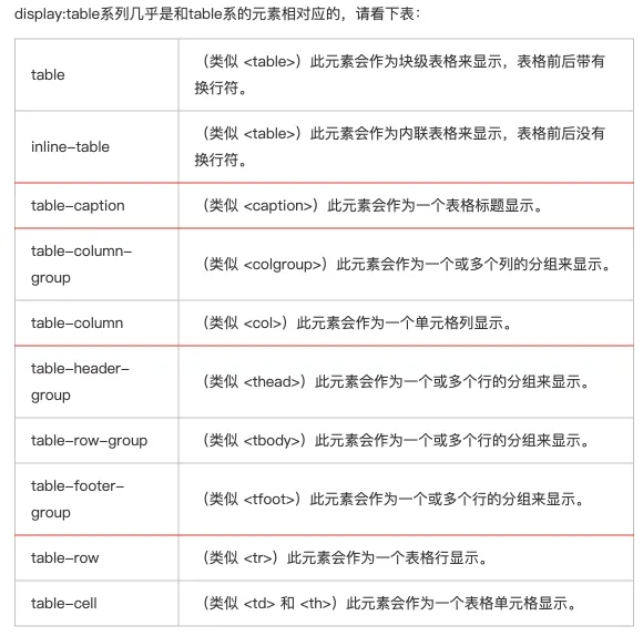
display:table系列值几乎是和<table>标签系列 相对应,请看下表
为什么不建议使用table布局?
- table会阻塞浏览器渲染引擎的渲染顺序。
- chatGPT说,当浏览器遇到
<table>元素时,它需要先计算和渲染整个表格结构,以确定每个单元格的大小和位置,然后才能继续渲染后续的内容。 - 浏览器在渲染页面时,按照从上到下、从左到右的顺序逐个处理DOM元素,当遇到
<table>元素时,需要处理完整个表格结构,当表格结构比较复杂或数据量大时就会阻塞后续内容的渲染。
- chatGPT说,当浏览器遇到
- table中每个元素的大小以及内容的改动,都会导致整个table的重新计算
- 在某些浏览器中,table里文字的copy会出问题
- table一旦设计完成就变成死的,很难通过CSS让它展示新的面貌。
参考资料
本文作者:郭敬文
本文链接:
版权声明:本博客所有文章除特别声明外,均采用 BY-NC-SA 许可协议。转载请注明出处!